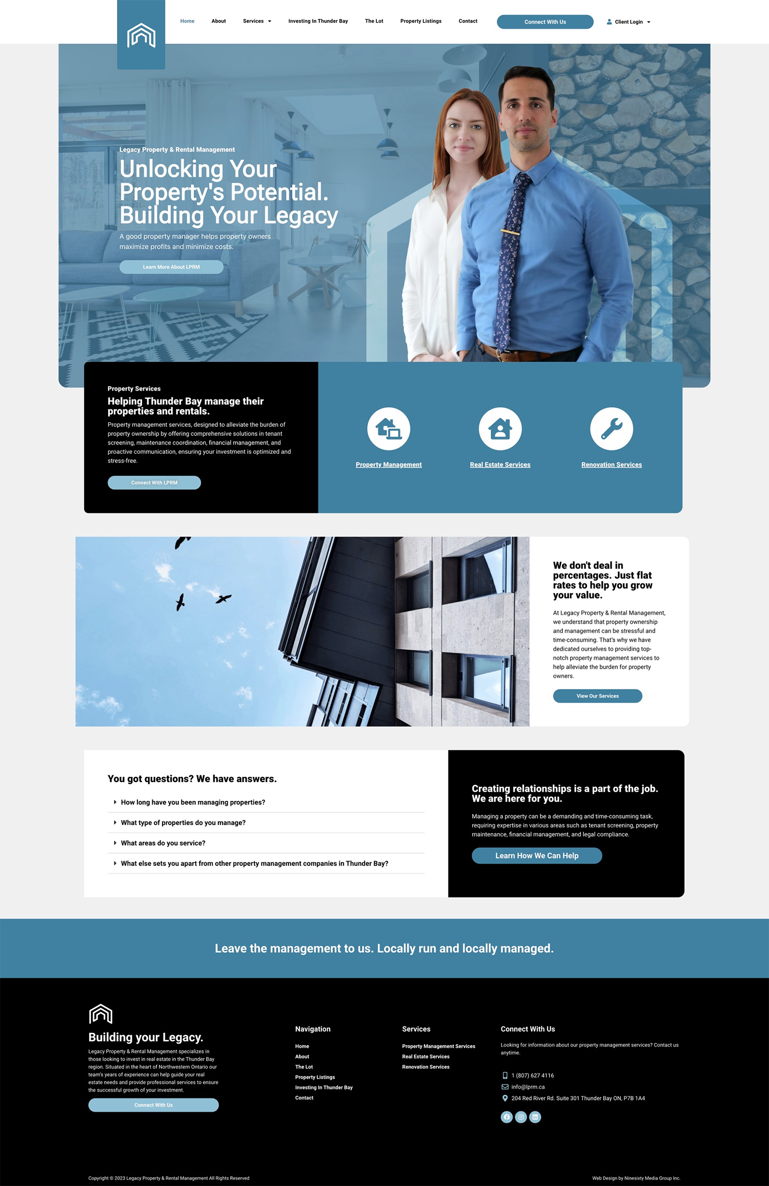
It's time to build a property management company that you can trust.
Legacy Property Management is a property management company based in Thunder Bay, Ontario, specializing in residential and commercial property management services. With a commitment to delivering exceptional service, they sought to revamp their branding and establish a robust online presence to attract new clients and streamline their operations.
The rebranding and web design project for Legacy Property Management in Thunder Bay successfully achieved its objectives. Legacy Property Management now has a modern brand identity and a user-friendly website that helps them attract new clients and streamline their operations. This case study highlights the importance of a cohesive brand identity and an effective online presence for businesses in the property management industry.
We started by conducting in-depth research into Legacy Property Management's business, industry, and competitors. We also engaged in discussions with the client to understand their vision, values, and goals.
01
Challenge
Legacy Property Management approached our design agency seeking a complete rebranding and an updated web presence. The primary challenges included:
Legacy Property Management existing brand identity and website no longer represented the firm’s values, vision, and innovative design approach.
Legacy Property Management’s web presence was lacking a professional look and user experience. Creating a new design that was based on the new branding was the goal.
02
Branding Solution
We started by conducting in-depth research into Legacy Property Management’s business, industry, and competitors. We also engaged in discussions with the client to understand their vision, values, and goals.
It was important to choose a colour palette that was inviting and professional. We chose a series of blues and greys to bring the brand full circle and in still trust onto potential new clients.
Choosing the right typeface is important. When creating the Legacy brand we chose to use a series of San Serif font to create an easy to read corporate look. This allowed the use of clever typography in areas to get get the message across more efficently.
03
Web Solution
Our team designed and developed a custom website that aligned with the rebranded image. Key elements of the website included:


